


Scrum Dashboard: How to Create, Optimize, and Use It Effectively
Scrum is widely adopted, yet many teams still struggle to gain visibility into sprint execution. According to the Annual State of Agile Report, 63 percent of Agile teams use Scrum as their primary delivery framework, making it the most common Agile approach today. Even so, many teams lack a clear way to see delivery risk, workflow bottlenecks, and sprint health early enough to act.
When standups consistently run over time, blockers surface too late, and sprint updates require digging through Jira filters, the issue is rarely planning or ceremony design. It is a visibility gap. Teams are busy, but they lack a shared, reliable view of how work is progressing across the sprint.
This guide focuses on closing that gap. You will learn how teams use dashboards to understand sprint health, which metrics reveal real execution signals, and how to design dashboards that support daily decisions. By the end, you will know how to turn sprint data into clarity that your team can act on.
Key Takeaways
Scrum dashboards exist to support sprint decisions, not to replace standups or act as reporting artifacts for leadership.
Teams run into execution problems when Scrum boards, dashboards, and Kanban are used interchangeably without clarity about which decision each supports.
A small set of well-chosen metrics exposes delivery risk earlier than a large dashboard filled with low-impact charts.
Dashboards become useful only when teams review patterns across multiple sprints instead of reacting to single-sprint results.
The most effective dashboards change as teams mature, shifting focus based on current delivery constraints rather than fixed templates.
What a Scrum Dashboard Really Is (and Why Teams Depend on It)
A scrum dashboard is a centralized view of sprint execution data that shows how reliably a team delivers work over time.
It summarizes sprint commitments, completions, and workflow to help teams assess delivery health and predictability.
Scrum dashboards exist because, as teams scale, delivery can no longer be evaluated solely through standups or intuition. Individual updates show activity, but they don’t reveal patterns. Dashboards aggregate sprint data so teams can see consistency, variation, and emerging risk across multiple sprints.
In practice, teams rely on scrum dashboards to answer a small set of critical questions:
Are we delivering what we commit to each sprint?
Is our capacity stable or drifting?
Where does work tend to slow down or pile up?
For engineering managers, dashboards provide a high-level view of execution reliability without pulling them into day-to-day delivery details.
Scrum Board vs Scrum Dashboard vs Kanban: Choosing the Right Tool for the Right Job
Scrum boards, scrum dashboards, and Kanban boards often coexist in modern Agile teams, but each serves a different purpose. Confusing them leads to unclear expectations about what to check, when, and why.
At a high level, each tool supports a different execution layer. Scrum boards help teams manage work in progress. Scrum dashboards help teams evaluate sprint health. Kanban focuses on optimizing flow when work arrives continuously.
Here's the breakdown:
Aspect | Scrum Board | Scrum Dashboard | Kanban Board |
Primary Job | Execute work within a sprint. | Evaluate sprint health and predictability. | Optimize the continuous flow of work. |
What It Shows | Current task status, assignments, workflow columns. | Aggregated metrics, trends, and burndown patterns. | Work items that are moving through flow stages. |
Update Pattern | Real-time as developers move cards. | Auto-refresh based on board data. | Continuous updates as work is pulled. |
Who Uses It | Developers, QA, and anyone moving tasks daily. | Scrum Masters, managers, stakeholders. | Teams handling interrupt-driven or unplanned work. |
Focus | Tactical: What should I work on next? | Strategic: Are we on track for sprint goals? | Flow-based: Where is work getting stuck? |
Time Range | Current sprint only. | Multiple sprints for trend analysis. | Ongoing with no sprint reset. |
Interaction | Manual drag and drop. | Visual consumption of charts. | Pull-based movement with WIP limits. |
Decision Type | Task prioritization. | Sprint scope and capacity adjustments. | Bottleneck identification and flow improvement. |
Use your Scrum board during standups when discussing specific tasks. Check your dashboard to understand sprint health, velocity stability, and whether work is piling up mid-sprint. Rely on Kanban when work arrives unpredictably, and flow matters more than sprint commitments.
High-performing organizations are explicit about which tool they rely on for which decision. Scrum boards coordinate execution, dashboards guide planning and retrospectives, and Kanban improves flow where sprint planning breaks down.
Also Read: Sprint Velocity in Scrum: How to Measure and Calculate It Right?

Key Scrum Dashboard Metrics for Tracking Sprint Execution
Your dashboard should track specific metrics that reveal sprint health, team capacity, and delivery predictability. Each metric answers a distinct question about how your sprint is actually going.
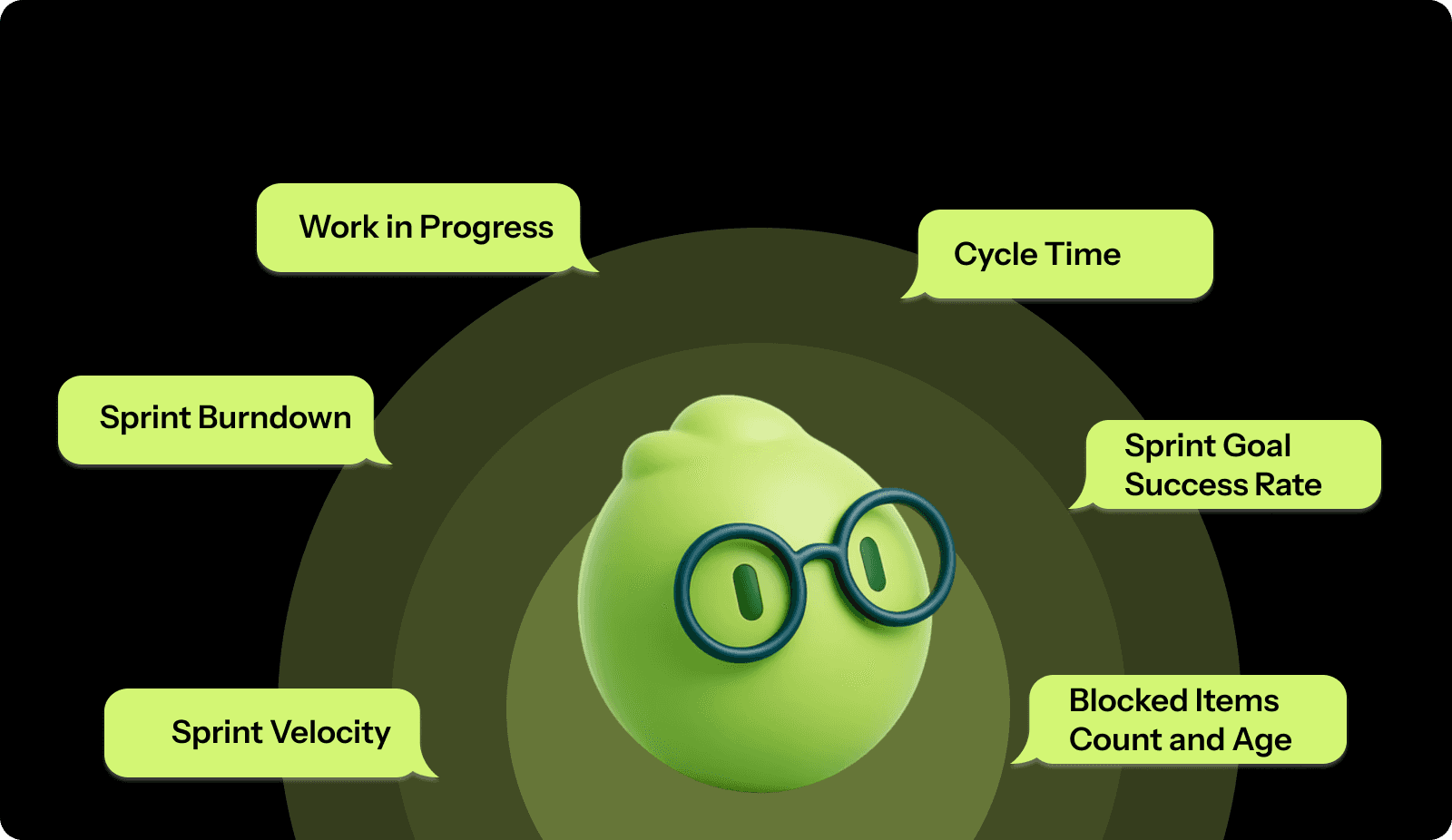
Here are the six core metrics that belong on every Scrum dashboard:
Sprint Velocity
Velocity measures the total story points your team completes per sprint. It's your baseline for understanding sustainable capacity.
How to measure it
Sum all completed story points at the sprint end.
Only count fully finished work that meets your Definition of Done.
Track this across at least five sprints to establish a reliable average.
Calculate your average velocity by adding the last five sprints and dividing by five.
What it tells you: A relatively stable velocity trend (with normal sprint-to-sprint variation) usually indicates more predictable delivery. Large swings can signal estimation issues, scope churn, unplanned work, or changing team capacity.
Consistently increasing velocity might signal improved estimation skills or growing team maturity. Whereas, consistently decreasing velocity could mean accumulating technical debt, burnout, or too much unplanned work bleeding into sprints.
Sprint Burndown
Burndown plots remaining work against time throughout your sprint. The x-axis shows days; the y-axis indicates the number of story points left. Your actual burndown line should trend downward to zero by the end.
How to measure it:
Plot total sprint commitment on day one.
Each day, subtract completed points from the remaining total and plot the new value.
Compare your actual line against an ideal line that decreases evenly from sprint start to finish.
A healthy burndown shows steady progress. If your line stays flat for multiple days, work is blocked, or the team is stuck. If it suddenly drops near the sprint end, the team may be rushing or marking incomplete work done. If the line trends upward, you're experiencing scope creep with new work added mid-sprint.
Work in Progress (WIP)
WIP counts the number of items your team actively works on simultaneously. High WIP means scattered attention and longer cycle times.
How to measure it:
Count work items in "In Progress" status on your board.
Track this daily and calculate the average WIP. Many teams improve flow by setting explicit WIP limits and keeping active work small enough to avoid constant context switching. A practical starting point is to agree on a team-level WIP limit, observe the sprint cycle time, then tighten or loosen based on evidence.
What it tells you: High WIP with slow velocity indicates your team spreads attention too thin, increasing cycle time and reducing throughput. Low WIP and items moving quickly signal strong focus. If WIP is high but velocity is normal, you're likely accumulating half-finished work that creates delivery risk.
Cycle Time
Cycle time measures elapsed time from when work starts until it's marked complete. It answers: How fast are we actually delivering?
How to measure it:
Record timestamps when stories move to "In Progress" and "Done."
Calculate elapsed time in days.
Track cycle time separately for different work types, features, bugs, and tech debt, since they have different complexity profiles.
Consistent cycle times indicate healthy flow. Longer cycle times typically signal complexity, testing gaps, or dependency issues, while extreme outliers highlight stories that need deeper review.
Sprint Goal Success Rate
This tracks the percentage of sprints where you achieve your sprint goal. It measures actual business value delivered, not just story points completed.
How to measure it:
At sprint planning, define a clear sprint goal beyond "complete these stories." At the sprint review, mark each sprint as "goal met" or "goal not met."
Calculate success rate as (sprints with goals met / total sprints) × 100.
Track quarterly to identify trends.
What it tells you: Success rates above 80% indicate good planning discipline and realistic commitments. Low success rates suggest chronic overcommitment, poor estimation, or frequent mid-sprint scope changes. This metric is more valuable than velocity because it measures outcomes rather than just output.
Blocked Items Count and Age
Track how many items are blocked and how long they've been stuck. This reveals impediment removal effectiveness.
How to measure it:
Add a "blocked" flag to your workflow. When an item is blocked, record the date.
Count the total number of blocked items daily and calculate the average age.
Agree on a clear “blocked SLA” as a team (for example, escalating after a set number of days). The goal is to make blockers visible early and treat aging blocks as a sprint risk signal, not a normal state.
More blocked items suggest growing dependencies or unclear requirements. Block age reflects how quickly issues are resolved, while repeated block patterns point to underlying process problems.
These six metrics together give you complete sprint health visibility without creating measurement overhead that slows your team down. However, tracking these metrics consistently across sprints often becomes manual and error-prone as teams scale. Tools like Entelligence AI automate sprint health tracking directly from your existing tools, surfacing delivery risks and trends without extra reporting overhead.
Also Read: Decoding Source Code Management Tools: Types, Benefits, & Top Picks
How to Create a Scrum Dashboard That Teams Actually Use?
Building an effective dashboard requires connecting the right data, selecting metrics that drive decisions, and designing views that enable people to act quickly.
Step 1: Pick Your Platform
Start with a platform that fits naturally into your existing workflow. The goal is to avoid manual updates and duplicate tracking. Your dashboard should pull data directly from your Scrum board and update automatically as work moves through the sprint.
Prioritize tools that integrate with the systems your team already uses, require no custom development, and are easy for everyone to access. The best platform is usually the one engineers interact with daily, not a separate reporting layer that only managers open.
Step 2: Connect Data Sources
Link your dashboard to all systems tracking sprint work. Start with your Scrum board, then add version control integrations to correlate commits with stories.
Configure automatic data sync to refresh at least hourly during sprint hours. Real-time updates are ideal but not always necessary. Avoid daily-only refreshes; they make your dashboard stale and untrustworthy.
Verify accuracy by comparing dashboard numbers against manual counts for your first week. If discrepancies exist, investigate whether workflow states are configured correctly.
Step 3: Start with Essential Metrics
Begin with four to six core metrics rather than displaying everything. Your initial dashboard should include the sprint burndown, the velocity trend for the last six sprints, the current WIP count, and blocked items.
For each metric you add, identify the specific question it answers. If you can't articulate why you're tracking something, don't include it. Your dashboard should drive action, not just display information.
Step 4: Design for Quick Decisions
Organize metrics by frequency of use. Put the sprint burndown and WIP count at the top since teams reference these daily. Place trend charts below since these inform planning discussions less frequently.
Use visual hierarchy to make problems obvious at a glance. Red for blocked items over three days old. Yellow when the actual burndown diverges more than 20% from the ideal. Green for on-track sprints.
Keep charts simple. A burndown needs two lines, sprint boundaries, and clear axis labels. Don't add so many data series that the chart becomes unreadable.
Tip: Use color consistently. If red means "blocked" in one widget, it should never mean "completed" in another.
Step 5: Make It Accessible
Make your dashboard visible to everyone who needs it. The Scrum Master shouldn't be the only person who can view sprint health.
Create a public URL to display on office monitors, or share it in your team channel. Set up mobile views for remote members. Configure read-only access for stakeholders who need visibility but shouldn't modify the dashboard.
Step 6: Build It Into Ceremonies
Define when your team will reference the dashboard. Incorporate it into existing meetings rather than creating new ones.
Daily standup: Display sprint burndown and blocked items. Team members quickly see if the sprint is on track.
Sprint planning: Review the last five sprints of velocity data to inform commitments. Review cycle-time averages to validate estimates.
Sprint retrospective: Analyze why the actual burndown diverged from the ideal. Examine WIP trends to identify if context switching slowed the team.
Step 7: Iterate Based on Usage
Run your dashboard for a full sprint before making significant changes. Gather feedback about which metrics team members actually reference and which ones they ignore.
Ask: Did the dashboard help you make any decisions this sprint? What information did you need but couldn't find? What charts did you never look at?
Adjust based on actual usage patterns. If nobody checks a particular chart, remove it. If team members keep asking for a specific data point, add it.
Every quarter, evaluate whether your metrics still align with current challenges. As teams mature, dashboard needs evolve.
Also Read: Top 8 Developer Productivity Tools For Maximum Efficiency

Common Scrum Dashboard Mistakes to Avoid for Agile Execution
Even teams with strong Agile practices can end up with dashboards that create confusion instead of clarity. Avoiding these common mistakes helps ensure your dashboard supports better execution rather than becoming another ignored artifact.
Tracking Too Many Metrics at Once
Dashboards lose effectiveness when they try to show everything. When too many charts compete for attention, teams struggle to identify which signals matter and gradually stop using the dashboard altogether.
Focus on five to seven metrics that directly support sprint decisions.
Add new metrics only when they answer recurring questions from the team.
A smaller set of metrics keeps attention focused and makes trends easier to spot.
Relying on Metrics That Distort Behavior
Some metrics look useful on the surface but fail to reflect real progress. Tracking raw story point totals, individual productivity, or velocity gains caused by inflated estimates can give a misleading picture of delivery.
Align metrics with sustainable delivery and business outcomes.
Track quality indicators alongside speed.
Emphasize sprint goals achieved over volume of work completed.
Dashboards should reinforce healthy delivery patterns, not reward activity without impact.
Making the Dashboard Hard to Access
Dashboards that require multiple logins, special permissions, or deep navigation rarely become part of daily work. Over time, they turn into reporting tools that teams maintain without relying on.
Place dashboards inside tools the team already uses.
Make sprint health visible during ceremonies and reviews.
Easy access increases adoption and keeps the data relevant.
Letting Data Become Outdated
When dashboard data doesn’t reflect the current reality, trust erodes quickly. Once teams notice inconsistencies, they stop relying on the dashboard to guide decisions.
Configure automatic data refreshes.
Display clear “last updated” timestamps.
Periodically verify dashboard data against source systems.
Accurate, timely data matters more than detailed visualization.
Designing the Dashboard Only for Leadership
Dashboards built solely for leadership rarely support execution. Teams view them as reporting obligations rather than tools that help them deliver better work.
Design dashboards around the needs of developers and Scrum Masters.
Ensure the dashboard supports standups, planning, and blocker resolution.
Dashboards are most effective when they provide shared visibility for both teams and leaders.
Ignoring Context Behind the Numbers
Metrics on their own can be misleading. A flat burndown may reflect blocked work or unexpected complexity. A dip in velocity might coincide with planned time off or cross-team dependencies.
Review metrics alongside insights from retrospectives and team discussions.
Investigate patterns before concluding.
Use dashboard trends to guide deeper analysis.
Context ensures metrics lead to understanding rather than incorrect assumptions.
Also Read: Sprint Review Guide: Definition, Goals, and Tips
Tips to Choose the Right Scrum Dashboard Approach for Your Team
Selecting the best dashboard strategy depends on team size, maturity, and workflow challenges. These criteria help you build a dashboard that fits your reality, rather than forcing your team to adapt to generic templates.
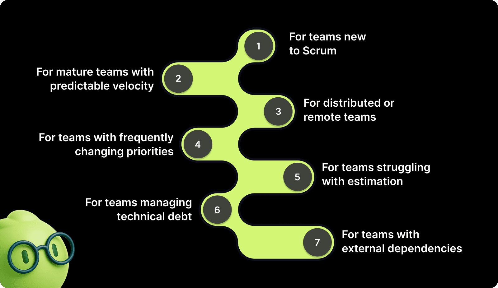
For teams new to Scrum: Start with minimum metrics, sprint burndown, velocity, and WIP. New teams need to establish basic sprint discipline before worrying about optimization metrics. Add complexity only after consistently completing three to four sprints on time.
For mature teams with predictable velocity: Focus on quality metrics and process efficiency. Track technical debt trends, automated test coverage, and mean time to recovery. These teams have mastered the basics and need insights about sustainable delivery.
For distributed or remote teams: Prioritize visibility and accessibility over visual polish. Make sure your dashboard works well on mobile devices. Add more detailed work-item information, since team members can't easily walk over to ask questions.
For teams with frequently changing priorities: Add metrics tracking, scope stability, and unplanned work. Measure the percentage of sprint commitments from planning versus work added mid-sprint. This data helps you have informed conversations with stakeholders about the cost of constant priority shifts.
For teams struggling with estimation: Focus on estimation accuracy metrics. Track story point variance between estimated and actual for completed stories. Visualize which work types you consistently underestimate. Use this data to refine planning poker sessions.
For teams managing technical debt: Add a technical debt ratio showing the percentage of sprint capacity dedicated to debt reduction versus new features. Track the trend over time to verify you're actually reducing debt rather than just talking about it.
For teams with external dependencies: Create a dependency tracker that shows work blocked by other teams, vendor deliveries, or infrastructure provisioning. Calculate the average time work spends blocked on external dependencies. This helps you negotiate better service levels or build buffer time into planning.
The right dashboard evolves as your team grows. What works perfectly for six months might become less relevant as challenges change.
Turn Scrum Dashboards Into Actionable Execution Insights with Entelligence AI
Building and maintaining effective Scrum dashboards takes time away from shipping software. Manual dashboard configuration, data validation, and metric interpretation create overhead that slows your engineering organization.
Entelligence AI eliminates this overhead by automatically generating intelligent dashboards that surface the insights you need. We don't just display data, we provide context about what it means and recommend specific actions to improve delivery velocity.
Here's how we help your team execute better:
Sprint Assessment Dashboards: Track planned versus completed work automatically across every sprint. Our AI identifies patterns in what types of work you consistently overcommit to and helps you make more realistic commitments. You get data-backed retrospectives that replace anecdotal feedback with concrete improvement opportunities.
Automated Performance Analytics: See exactly where bottlenecks occur in your delivery pipeline before they derail sprints. Entelligence AI monitors cycle times, identifies idle work, and flags dependencies blocking progress. You spend less time hunting for problems and more time solving them.
Individual and Team Productivity Insights: Understand how work is distributed across your team without micromanaging. Our platform shows where developers spend time, which tasks take longer than expected, and where your team might need additional support. This visibility helps you coach more effectively.
Contextual Code Review Integration: Catch potential bugs and architectural risks before they hit your sprint. Our AI reviews code directly in your IDE and flags issues that could slow sprint progress. You reduce PR review back-and-forth and maintain higher code quality without sacrificing velocity.
Real-Time Sprint Health Monitoring: Get automatic alerts when your sprint trends off track. Entelligence AI calculates the probability of meeting sprint goals based on current burndown rates and historical patterns. You can make proactive scope adjustments while there's still time.
Integrated Documentation and Knowledge Management: Stop losing context about why decisions were made or how systems work. Entelligence AI automatically generates and maintains documentation that keeps your team aligned. New members onboard faster, and existing members spend less time explaining the same concepts.
Entelligence AI works directly within your existing tools like GitHub, GitLab, Slack, and your IDE, so you don't need to switch contexts or maintain another platform. Your dashboard updates automatically as work progresses, providing you with reliable data without manual intervention.
Conclusion
Creating a Scrum dashboard that your team actually uses requires more than displaying charts. You need to connect the right data sources, track metrics that directly inform sprint decisions, and design views that make problems obvious before they blow up timelines.
Start with fundamentals and build incrementally based on the specific challenges your team faces, rather than tracking every possible metric from day one.
The best dashboards evolve with your team. What matters when learning Scrum differs from what you need when optimizing for scale. Review metrics quarterly and remove anything that doesn't actively help your team execute better.
Entelligence AI removes the manual effort required to build and maintain these dashboards. Our platform automatically surfaces the insights you need, provides context about what the data means, and recommends specific improvements to sprint execution. You get the visibility you need to lead effectively without the overhead of manual tracking.
Ready to stop chasing sprint updates and start driving measurable improvements in your engineering velocity? Start your free trial with Entelligence AI today and see how intelligent dashboards help your team ship faster with higher quality.
FAQ’s
1. What is the difference between physical scrum dashboards and online scrum dashboards?
Physical scrum dashboards use whiteboards and sticky notes in shared spaces, while online scrum dashboards aggregate live data digitally, enabling remote access, automation, trends, and scalability.
2. What is the Jira dashboard for Scrum?
A Jira Scrum dashboard is a customizable view of sprint metrics, issues, and progress pulled from Jira boards, helping teams monitor sprint health and predictability.
3. What is the 3-5-3 structure of Scrum?
The 3-5-3 structure refers to Scrum's three core roles (Product Owner, Scrum Master, Developers), five events (Sprint, Sprint Planning, Daily Scrum, Sprint Review, Sprint Retrospective), and three artifacts (Product Backlog, Sprint Backlog, Increment). This framework ensures clear responsibilities, time-boxed collaboration, and transparent progress tracking.
4. What metrics should be included in a Scrum dashboard?
Essential Scrum dashboard metrics include sprint burndown, velocity trends, work in progress, cycle time, blocked items, and sprint goal success, supporting faster, data-driven decisions.
5. How often should a Scrum dashboard be reviewed?
Teams should review Scrum dashboards daily during standups to monitor execution signals and across multiple sprints during planning and retrospectives to identify trends and improve predictability.